Landing Page Mistakes Found in 100 Roasts
We analyzed 100+ landing page roasts on RoastGPT. Here are the most common mistakes from weak CTAs and navigation overload to trust gaps and copy that doesn't convert and how to fix them.

After running more than 100 landing page roasts on RoastGPT across SaaS, e‑commerce, agencies, startups, and more, certain mistakes show up again and again. Not every page has every flaw, but if you’ve never had your page roasted, there’s a good chance you’re making at least a few of these. Here’s what we keep seeing, why it hurts, and how to fix it.
How We Got Here: 100 Roasts, One Pattern
Every roast on Roast My Landing Page uses AI personas (UX designers, conversion consultants, copywriters, accessibility advocates, and others) to score and critique real pages. We looked at the combined feedback from over 100 of those roasts and grouped the most frequent issues. The result is a clear hit list of what’s killing clarity, trust, and conversions—and what to do instead.
1. Hero Section That Doesn’t Land

What we see: Headlines that are vague (“We help grow your business”), no clear benefit in the first sentence, or a hero that tries to say everything and ends up saying nothing. Sometimes the primary CTA is missing or buried below the fold.
Why it matters: You have a few seconds to answer “What is this?” and “Why should I care?” If the hero fails, bounce rate goes up and conversion goes down.
Fix: One clear value proposition above the fold. One primary CTA. No jargon. If you’re not sure yours is clear, roast your landing page and check what the Grumpy UX Designer or Confused Customer persona says about your hero.
2. Navigation Overload
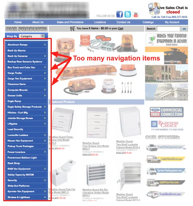
What we see: Nav bars with 10+ items, dropdowns inside dropdowns, or links that duplicate each other. Users don’t know where to go first; “Pricing” and “Get Started” get lost in the noise.
Why it matters: Confusing navigation tanks our navigation scores in roasts. People leave instead of clicking through.
Fix: Limit top-level items (5–7 is a good target). Group the rest under clear categories or move secondary links to the footer. Test on mobile: hamburger menus shouldn’t turn into a novel.
3. CTAs That Don’t Stand Out (or Don’t Work)
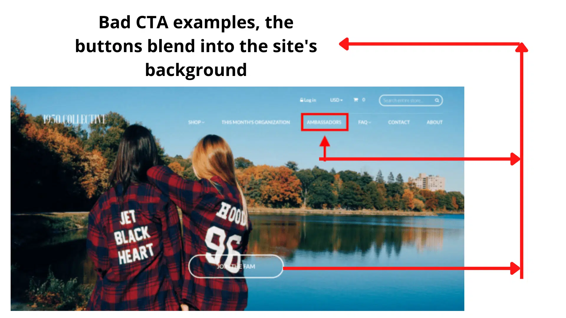
What we see: Buttons that look like the background (“Learn More” in gray on gray), CTAs that are tiny or hidden, or—worse—buttons that don’t work or don’t go anywhere. In multiple roasts we’ve seen “Create” or “Get Started” buttons that do nothing when clicked.
Why it matters: The CTA is where conversion happens. If it’s invisible or broken, you get zero credit for the rest of the page.
Fix: High-contrast, action-oriented copy (“Start free trial” > “Submit”). One primary CTA per section. Test every button. Run a landing page roast with the Conversion Consultant persona to get direct feedback on your CTAs.
4. Copy That Talks But Doesn’t Convert
What we see: Long paragraphs with no clear outcome, generic claims (“best-in-class,” “innovative”), or copy that explains features without benefits. Headlines that could apply to any company in the space.
Why it matters: Weak copy shows up in roasts as low readability and conversion scores. If the Copywriting Comedian persona is roasting you for “saying a lot but not making people click,” it’s time to tighten the message.
Fix: Lead with the outcome for the user. One idea per section. Replace buzzwords with specifics. If you’re not sure where the copy fails, roast the page and use the Copywriting Comedian or Marketing Guru persona.
5. Trust and Social Proof Gaps
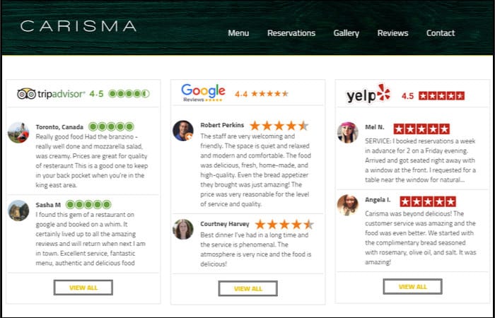
What we see: No testimonials, no logos, no proof of results. Or social proof that’s vague (“Loved by thousands”) with no names, roles, or outcomes. Privacy and security get one line in the footer—if that.
Why it matters: Visitors don’t convert until they trust you. Missing or weak proof is one of the most common themes in our roasts.
Fix: Add real testimonials with name, role, and result. Show customer or partner logos where it’s genuine. Mention security, guarantees, or certifications near the CTA. The Brand Therapist and Conversion Consultant personas on Roast My Landing Page often call out exactly where trust is missing.
6. Visual Hierarchy and Contrast Failures
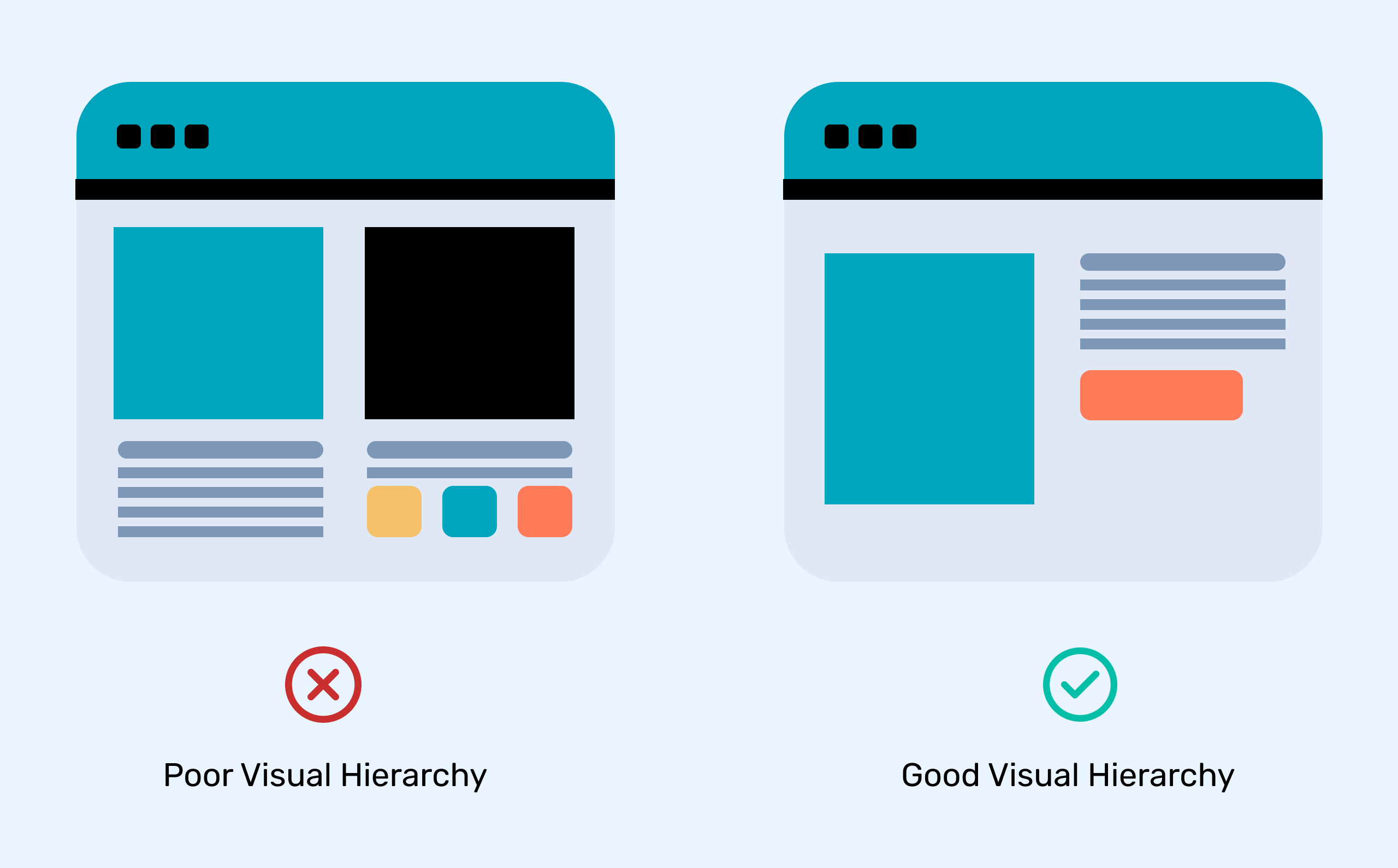
What we see: Everything the same size and weight, or low-contrast text (light gray on white, white on light blue). Sections run together; users don’t know what’s a headline and what’s body.
Why it matters: Poor hierarchy and contrast hurt readability and hierarchy scores in every roast. They also fail accessibility basics.
Fix: Clear heading levels (one H1, then H2s for sections). Contrast ratio at least 4.5:1 for body text. Use size, weight, and spacing so the eye has a path. The Accessibility Advocate persona will tear into contrast and structure—use it to find issues before users do.
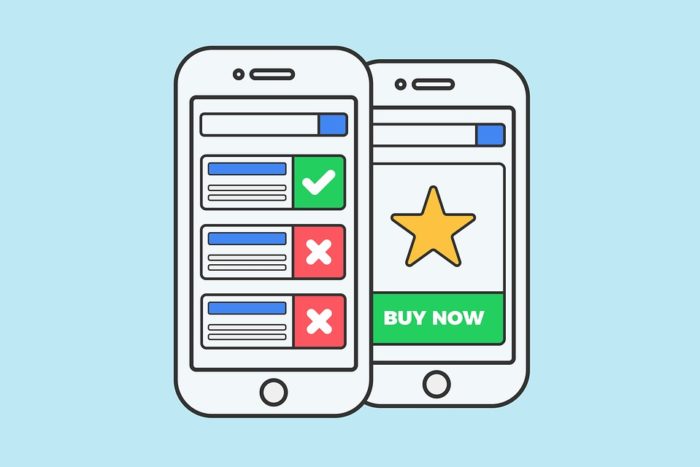
7. Form Friction
What we see: Forms with 10+ fields, required fields that aren’t needed for the first step, or no indication of progress (e.g. no step indicator on multi-step forms). Sometimes the “Submit” button is below the fold or looks disabled.
Why it matters: Every extra field costs conversions. Our Form Flow Inspector persona exists because this mistake is so common.
Fix: Ask only what you need for this step. Use multi-step forms with clear progress. Make the submit button obvious and clickable. Roast your page with the Form Flow Inspector to get a field-by-field critique.
8. Mobile and Responsiveness Issues
What we see: Tiny tap targets, text that’s unreadable without zooming, horizontal scroll, or CTAs that are hard to reach one-handed. Desktop-first layouts that look like an afterthought on phones.
Why it matters: A huge share of traffic is mobile. When the Mobile-First Inspector roasts your page, it’s because thumb zones and readability on small screens are broken.
Fix: Test on real devices. Buttons and links at least 44×44px. No horizontal scroll. Key actions in the thumb zone. Run a roast and check the Mobile-First Inspector feedback.
9. Performance and Load Problems
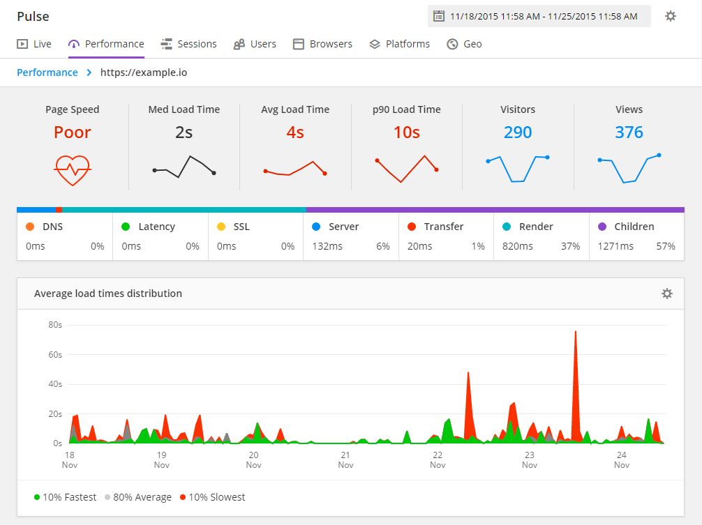
What we see: Heavy hero images, too many scripts, or render-blocking resources. Pages that take 5+ seconds to become usable. The Performance Guru and Speed Freak personas flag this constantly.
Why it matters: Slow pages lose users and rank worse. Core Web Vitals matter for both UX and SEO.
Fix: Optimize images (format, size, lazy load). Defer non-critical JS. Trim unused CSS. Aim for LCP under 2.5s. A landing page roast won’t fix your server, but it will call out where the experience feels slow or heavy.
10. Footer That Dominates (or Confuses)
What we see: Footers with dozens of links, repeated nav, and no clear “last CTA.” Or the opposite: a huge footer that competes with the main content and the final call-to-action.
Why it matters: The footer should support the page, not replace it. In roasts we see “footer bloat” and “buried CTA” over and over.
Fix: Keep the footer focused: key links, legal, contact, maybe one repeated CTA. Don’t duplicate the entire nav. Make the last thing you want the user to do (sign up, book, buy) obvious before they hit the footer.
11. No Clear Audience or Positioning

What we see: Pages that try to speak to “everyone.” Messaging that could fit a dozen different products. No “who this is for” or “what we do in one sentence.”
Why it matters: The Marketing Guru persona is built to catch this: “Your positioning is trying to talk to everyone… so it persuades no one.”
Fix: Name your primary audience. Write one sharp positioning line. Test it with a roast and see if the Confused Customer or Marketing Guru still says “I don’t get who this is for.”
12. Inconsistent Branding and Tone
What we see: 6 different logos, mixed fonts, random color use, or tone that swings from corporate to casual between sections. Social links or visuals that don’t match the rest of the page.
Why it matters: Inconsistency feels unprofessional and undermines trust. The Brand Therapist persona often flags “identity crisis” when the page doesn’t feel like one brand.
Fix: Stick to a small set of fonts and colors. Define a tone (e.g. “professional but friendly”) and keep it across sections. Align social proof and imagery with that voice.
13. Accessibility Oversights
What we see: Missing or empty alt text, poor focus states, low contrast, or interactive elements that aren’t keyboard-friendly. Labels and ARIA are an afterthought.
Why it matters: Accessibility isn’t optional. It’s the right thing to do and it often aligns with better UX for everyone. The Accessibility Advocate persona in our roasts is strict for a reason.
Fix: Add meaningful alt text. Ensure 4.5:1 contrast (or better). Test keyboard navigation and focus order. Use semantic HTML and ARIA where needed. Roast your page with the Accessibility Advocate to get a focused a11y critique.
14. Interaction and Feedback Gaps
What we see: Buttons and links with no hover or focus state, carousels with no scroll hint, or forms that don’t show loading or success states. The page feels static and “unfinished.”
Why it matters: In roasts, pages like this get hammered on interaction scores. Users expect feedback when they click or tap.
Fix: Add hover and focus styles. Use loading spinners or disabled states on submit. Make carousels obviously scrollable (arrows, dots, or a hint). Small details add up.
15. Too Much (or Too Little) Above the Fold
What we see: Either a hero so packed that nothing stands out, or so little content that the fold feels empty and vague. No balance between “tell me more” and “give me one thing to do.”
Why it matters: The fold still shapes attention. Clutter and emptiness both hurt.
Fix: One main headline, one subline, one primary CTA. Enough context to understand the offer; not so much that the eye has nowhere to land. Use the Grumpy UX Designer or Unimpressed UI Designer on Roast My Landing Page to see how your fold is read.
What the Numbers Say (Across 100+ Roasts)
When we tallied feedback from over 100 roasts, the most cited problem areas were:
| Mistake category | How often we see it |
|---|---|
| Weak or broken CTAs | Very high |
| Navigation overload | Very high |
| Unclear value prop / hero | High |
| Copy that doesn’t convert | High |
| Trust / social proof gaps | High |
| Visual hierarchy / contrast | High |
| Form friction | Medium–high |
| Mobile / responsiveness | Medium–high |
| Performance / load | Medium |
| Footer bloat | Medium |
None of this means your page is doomed. It means these are the usual suspects—and they’re fixable. The first step is seeing them clearly. That’s exactly what a landing page roast is for: no sugar-coating, just scores and section-level feedback so you know what to fix first.
What to Do Next
- Run a roast. Go to Roast My Landing Page, paste your URL, and pick a persona (e.g. Grumpy UX Designer or Conversion Consultant for a first pass).
- Fix the biggest issues. Use the report to tackle hero, nav, CTA, and trust before fine-tuning the rest.
- Roast again. After changes, run another roast—maybe with a different persona (e.g. Accessibility Advocate or Mobile-First Inspector)—to stress-test specific areas.
The same mistakes we’ve seen in 100 roasts are the same ones that hold most pages back. Spot them, fix them, and use RoastGPT to keep yourself honest.