Landing Page Mistakes Killing Your Conversions
The most common landing page mistakes silently killing your conversions and how to spot, prioritize, and fix them using RoastGPT’s landing page roast.
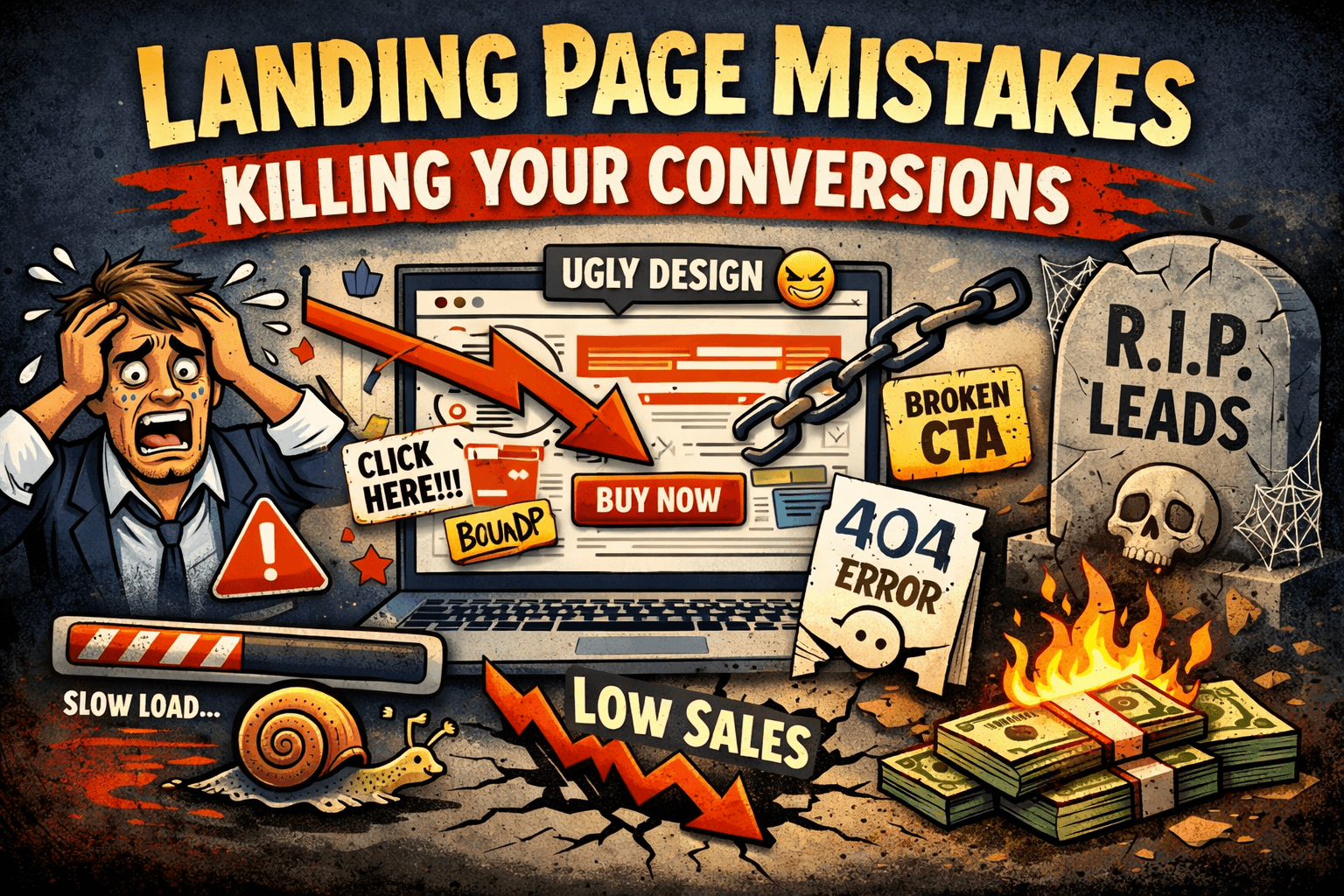
You don’t lose conversions because of one big, obvious disaster. You lose them in dozens of tiny, boring ways: a buried CTA here, a vague headline there, a missing testimonial, a slow hero image that loads half a second too late. None of these look fatal on their own but together, they quietly kill your conversion rate.
After roasting hundreds of pages on Roast My Landing Page, we see the same patterns over and over. This article breaks down the most common mistakes killing your conversions, how to tell if each one is happening on your page, and how to fix them with help from RoastGPT’s personas and reports.
1. Your Value Proposition Is Hiding
Symptom: People land, skim, and bounce. You get impressions and clicks… but almost no signups, demos, or trials.
What’s going wrong:
- The hero headline is vague or generic (e.g. “We help businesses grow”).
- You describe what you are, not what you do for the visitor.
- The main benefit is stuck in a paragraph or graphic instead of being front and center.
Why this kills conversions: If visitors can’t answer “What is this?” and “Why should I care?” in about three seconds, they won’t invest the effort to figure it out. They’ll hit back and try the next tab.
How to spot it:
- Do a 5-second test with someone who has never seen your page.
- Or run a landing page roast with Confused Customer or Marketing Guru, they’re trained to call out fuzzy value props.
Fix:
- One clear headline that states the outcome or core offer.
- One subline that adds context: who it’s for and what changes.
- Strip jargon and internal language. If it only makes sense inside your company, rewrite it.
2. Your CTAs Are Whispering (or Missing)
Symptom: Users scroll, read, maybe even engage with content but they rarely click your main button.
What’s going wrong:
- CTAs blend in with the background or other UI elements.
- The copy is weak or generic (e.g. “Learn more,” “Submit”).
- There are too many competing CTAs, or none above the fold.
Why this kills conversions: Even interested visitors need a clear, visible next step. If your CTA is visually quiet or conceptually vague, people won’t act even if they like what they see.
How to spot it:
- Squint at your page. Does the primary action still pop?
- Click through each section. Is it obvious which button matters most?
- Run a roast with the Conversion Consultant persona and see how often CTAs are mentioned.
Fix:
- One primary CTA per major section.
- High-contrast buttons with action-focused copy (e.g. “Start free trial,” “Get my report”).
- Place a primary CTA above the fold and at key decision points.
3. You’re Asking for Trust You Haven’t Earned Yet
Symptom: People hover over your CTA… and then don’t click. Or they start your form and abandon.
What’s going wrong:
- Little or no social proof (testimonials, logos, case studies).
- No reassurance about security, refunds, or support.
- Claims without evidence (“Trusted by thousands” with no details).
Why this kills conversions: Conversion is a trust transaction. You’re asking for time, data, or money. If the risk feels bigger than the reward, people stall out.
How to spot it:
- Read your page as a skeptic. Would you sign up based only on what’s shown?
- The Brand Therapist or Conversion Consultant personas on Roast My Landing Page often flag missing or weak trust cues.
Fix:
- Add testimonials with names, roles, and specific results.
- Show real customer logos where appropriate.
- Place guarantees, refund policies, or security notes near CTAs, not hidden in the footer.
4. You’re Talking About Features, Not Outcomes
Symptom: Lots of visitors scroll through your features but don’t start trials, book demos, or download anything.
What’s going wrong:
- Copy focuses on what your product does, not what changes for the user.
- Headlines read like internal roadmap bullets.
- Benefits (save time, reduce errors, increase revenue) are implied but not stated.
Why this kills conversions: People don’t buy features, they buy better versions of themselves or their business. If the page never connects the dots, motivation never peaks high enough to act.
How to spot it:
- Highlight every “we/our” vs every “you/your” on the page.
- If your feature list could describe a competitor, your positioning is probably too generic.
- The Copywriting Comedian persona loves to roast feature-dump copy.
Fix:
- Reframe each feature as “so that you can…”.
- Lead sections with outcomes, support them with features.
- Use concrete language: time saved, errors reduced, revenue gained.
5. Friction Between "Interested" and "Converted"
Symptom: People click your CTA but drop on the form or checkout step.
What’s going wrong:
- Long forms asking for everything at once.
- No progress indicator on multi-step flows.
- Confusing or competing options at the moment of decision.
Why this kills conversions: Every extra field and micro-decision is a chance for someone to bail. Friction doesn’t just lower conversion, it often filters out the exact people you want.
How to spot it:
- Fill out your own form on mobile. Count fields and clicks.
- Watch session recordings (if you have them) around your form/checkout.
- The Form Flow Inspector persona is built to attack this stage.
Fix:
- Ask only what you need for this step. Push optional details later.
- Use clear progress (e.g. “Step 1 of 3”).
- Reduce competing choices near the main CTA.
6. UX Makes Your Good Ideas Hard to Use
Symptom: Your offer and copy are strong, but the page still feels "off". People complain it’s hard to read or navigate.
What’s going wrong:
- Weak visual hierarchy: everything looks equally important.
- Low contrast text or busy backgrounds.
- No clear path for the eye from headline → proof → CTA.
Why this kills conversions: Even the best offer can’t overcome a layout that exhausts people. Cognitive load goes up; willingness to act goes down.
How to spot it:
- Test on a real phone and a small laptop screen.
- Use a contrast checker to see if your text passes basic accessibility.
- The Grumpy UX Designer or Unimpressed UI Designer personas frequently hammer on hierarchy and contrast.
Fix:
- Define a type scale and stick to it (H1, H2, body, etc.).
- Ensure at least 4.5:1 contrast for body text.
- Use spacing and dividers to separate sections logically.
7. Mobile Experience Is an Afterthought
Symptom: Desktop converts okay, but mobile traffic underperforms badly or users complain the page feels cramped or broken on phones.
What’s going wrong:
- Tiny tap targets and cramped layouts.
- Important content pushed far below the fold on mobile.
- Horizontal scrolling or clipped components.
Why this kills conversions: For many products, mobile is 50%+ of traffic. If your page only really works on desktop, you’re voluntarily throwing away half your potential conversions.
How to spot it:
- Open your page on a real device (not just a responsive preview).
- Try to complete the main action one-handed.
- The Mobile-First Inspector persona exists specifically to roast mobile UX.
Fix:
- Make buttons and links large enough (at least ~44×44px touch targets).
- Reorder or condense sections so key info and CTAs appear earlier on mobile.
- Remove horizontal scroll and fix any clipped text or cards.
8. No Clear Audience or Use Case
Symptom: Traffic is okay, but leads or customers are low quality or don’t show up at all.
What’s going wrong:
- Messaging tries to speak to everyone.
- No specific use cases or segments called out.
- Headlines and copy that could apply to half your category.
Why this kills conversions: When no one feels like “this is for me,” almost no one converts. People would rather bounce than decode who you’re trying to help.
How to spot it:
- Ask: Can I complete the sentence “This page is for [who] so they can [what]?”
- If not, the Marketing Guru or Confused Customer personas on Roast My Landing Page will absolutely point that out.
Fix:
- Choose a primary audience and say it out loud on the page.
- Add a section like “Who this is for” with 3–5 bullets.
- Use examples and language that mirror your ideal customer’s world.
9. Performance and Perceived Speed Are Ignored
Symptom: Analytics show high bounce on first load, especially on slower connections or mobile.
What’s going wrong:
- Huge hero videos or uncompressed images.
- Multiple trackers and scripts running before content is usable.
- No visual feedback while loading.
Why this kills conversions: People don’t wait around. A slow page makes you feel outdated or untrustworthy, and visitors often leave before the offer even appears.
How to spot it:
- Run Lighthouse or WebPageTest.
- Load your page over 3G or on an older phone.
- The Performance Guru or Speed Freak personas frequently call this out in roasts.
Fix:
- Compress and lazy-load images.
- Defer non-critical scripts.
- Make above-the-fold content render fast, even if secondary assets load later.
10. You’re Guessing Instead of Inspecting
Symptom: You’ve tweaked headlines, colors, and CTAs, but nothing seems to move the numbers. You’re not sure what to do next.
What’s going wrong:
- Changes are based on opinion or trends, not on structured feedback.
- You don’t have a clear map of where the page is strong vs weak.
Why this kills conversions: Without a diagnostic view, you end up making random changes. Some help, some hurt, most do nothing. Progress feels slow and unpredictable.
Fix:
- Treat your landing page like a system to be debugged, not a poster to be prettied up.
- Use analytics, session replays, and an opinionated external reviewer.
- That’s exactly what Roast My Landing Page is designed for: scores and section-level feedback from personas focused on UX, conversion, copy, trust, accessibility, and more.
Use Roasting to Turn Mistakes into Wins
The mistakes killing your conversions aren’t mysterious, they’re usually combinations of the patterns above: unclear value, weak CTAs, missing proof, friction, UX noise, and mobile or performance issues.
You don’t have to fix everything at once. Start by:
- Running a roast on Roast My Landing Page with a conversion-focused persona (e.g. Conversion Consultant or Grumpy UX Designer).
- Prioritizing 2–3 issues that show up repeatedly across personas: hero clarity, CTA visibility, trust, form friction, or mobile.
- Making targeted changes, then roasting again possibly with a different persona (e.g. Accessibility Advocate or Mobile-First Inspector) to stress-test specific areas.
If you want a more systematic pass, pair this article with the Landing Page Roast Checklist and the How to Roast a Landing Page (Complete Guide). Together, they give you a process: understand how roasting works, spot common mistakes, audit your own page, then let RoastGPT tell you—bluntly—what still needs work.