🥩 We Roasted 10 Landing Pages… Here’s What They All Got Wrong (Part 2)
 RoastGPT Team
Part 2: Real roast breakdowns of OmakaseAI, QuickMedCards, Roblox, CheapUI, and more. See what our AI found—and how to fix your own page.

Let's face it: most landing pages don't convert because they commit crimes against UX, clarity, and basic human attention spans. We used Roast My Landing Page to run 10 real-world landing pages through our AI—Grumpy UX Designer, Unimpressed UI Designer, and more—and got savage-but-actionable feedback.
Here’s what happened—and more importantly, what not to do on your own page.
💥 1. OmakaseAI.com
Roast Persona: Grumpy UX Designer
Summary: "An enchanting dance of overconfidence and eccentric design choices, the landing page tries to be more style than substance."
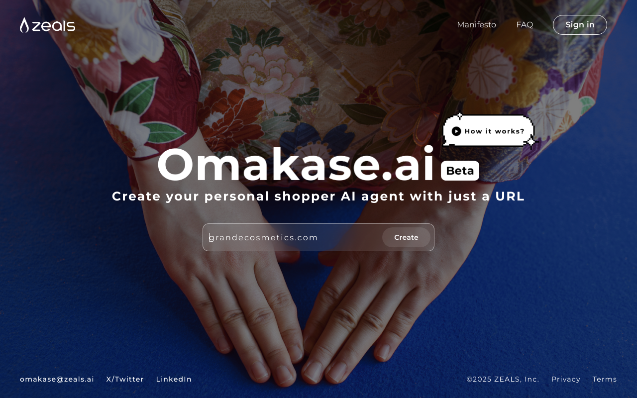
🔥 Roast Highlights:
- Ghost Button Syndrome: The 'Create' button looks bold but... doesn’t work. It’s a silent protest against functionality.
- Navigation Bar? Never Heard of Her. The menu is MIA. If you want users to guess their way around, mission accomplished.
- Background Mayhem: A chaotic visual palette that screams look at me—and forget everything else.
- Font Fatigue: Everything is Montserrat. Even Helvetica is offended.
- Jumbotron Footer: A footer so massive, users might assume they’ve reached the end of the internet.
💡 Fix This:
- Make sure buttons actually work—it’s a basic trust signal.
- Add visible, usable navigation to reduce bounce.
- Tame your background and font combinations to prioritize readability.
😏 Top Strengths
- Invisibility Cloak Nav: A great surprise for users seeking undocumented adventures.
- Montserrat Madness: Helvetica might be outraged, but your fixation on Montserrat everywhere is...a choice.
- Beautiful Buttons That Do Nothing: Button sizes are on point, making them look impressive, if only they worked.
- Footer Prominence: Large footer—perfect for those who landed on the page and forgot why.
- Consistency of Uselessness: Button shape consistency could have been a game-changer... if the buttons did anything.
- Zen Navigation: Links practice non-verbal communication skills—find your zen in clicking nowhere.
- Minimalist to a Fault: Your minimalistic touch on nav bars screams "discovered" and "challenging"!
😬 Top Weaknesses
- Dysfunctional Elements: Functional 'Create' button? Who needs it! Let imagination run wild with 'what if's.
- Illegible Text: Eyes half-closed struggle to read text: The ultimate eye test.
- Navigation Nightmares: Optimized for those practicing sixth sense only.
- Existential UX: The button poses an existential challenge: be but not act.
- Background Dominance: Background image wants to steal the show, audience optional.
- Contrast Crimes: Text hides better than a cat in a blackout—decipher this riddle, mortals!
- Distraction Design: Footer size: Because bigger is always better, as long as it distracts!
💥 2. QuickMedCards.com
Roast Persona: Unimpressed UI Designer
Summary: The landing page is a curious blend of style and confusion, like a fancy restaurant with no menu. It's enticing at first glance, but quickly leaves you scratching your head wondering what just happened.
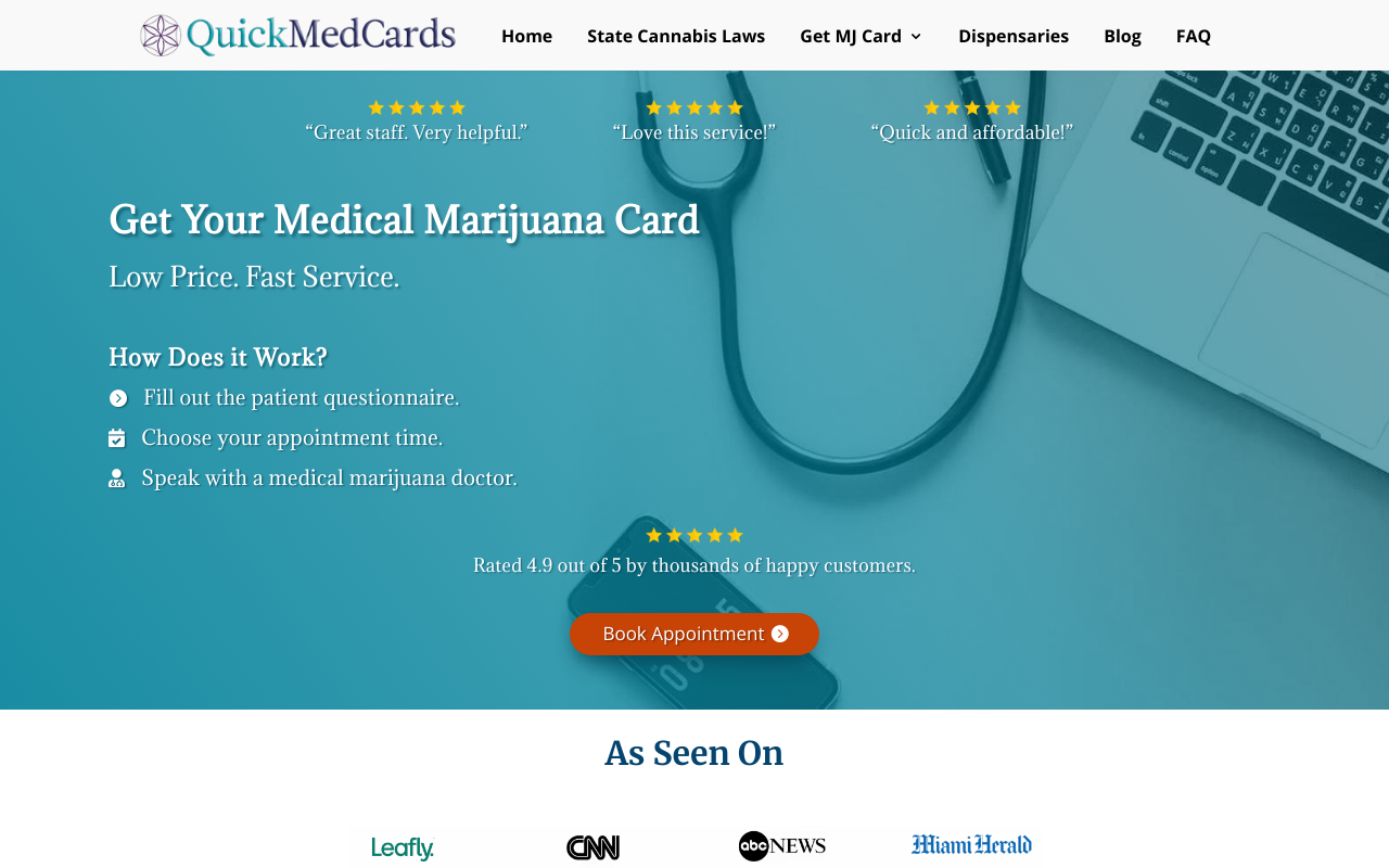
🔥 Roast Highlights:
- Navigation Nightmare: The menu is so bloated it feels like a UX obstacle course. Users shouldn't need GPS to find 'Book Appointment.'
- CTA Camouflage: Multiple buttons (like "Learn More") blend into the background or each other, leaving users disoriented.
- Clutter Olympics: Competing sections all scream for attention—headlines, testimonials, articles. Nothing stands out.
- Font Color Crimes: Headlines and text often suffer from weak contrast, especially against noisy or dark backgrounds.
- Useless Interaction: Carousels and icon lists lack hover effects or cues—creating a static, outdated feel.
💡 Fix This:
- Simplify the navigation with mega-menus or dropdowns.
- Re-style CTAs for contrast, size, and specificity (“See Recovery Tips” > “Learn More”).
- Apply visual hierarchy: one focal point per section.
- Use readable font colors and add hover effects to interactive elements.
😏 Top Strengths
- The dark theme attempts to convey sophistication, a bit like wearing sunglasses at night.
- There is a delightful amount of legal information that lets you know this isn't just a pharmacy with free samples.
- With all those footer links, it's like an Easter egg hunt for adults who like challenges.
- Feeling nostalgic for a simpler web? This footer’s dense 90s-vibe will take you back.
- The grayed-out footer text keeps users guessing—a mystery-solving delight for the curious!
- Visas logo spotted! At least your brand affinity is on point, right?
- Good luck finding the 'Contact Us' link at first glance; at least it's safe from spam!
😬 Top Weaknesses
- Footers are where design goes to hide, and this one mastered camouflage.
- A buffet of links crammed to challenge even the best navigators. It's cardio for the eyes!
- Text color and background are competing in 'Who Can Be Darker.' Spoiler: it's tough to tell who wins.
- Footer hierarchies are like rare treasures, but who wants that when you can have chaos?
- Contrast? What contrast? Even my mouse pointer needs a torch to navigate here.
- Legal text is tiny enough to test whether users need glasses, doubling as a health service.
- Want users to access contact info? Too bad! Here it's well-hidden like treasure in a pirate flick.
💥 3. Roblox.com (yes, that Roblox)
Roast Persona: Unimpressed UI Designer
Summary: If this design were any more basic, it would be classified as a placeholder.
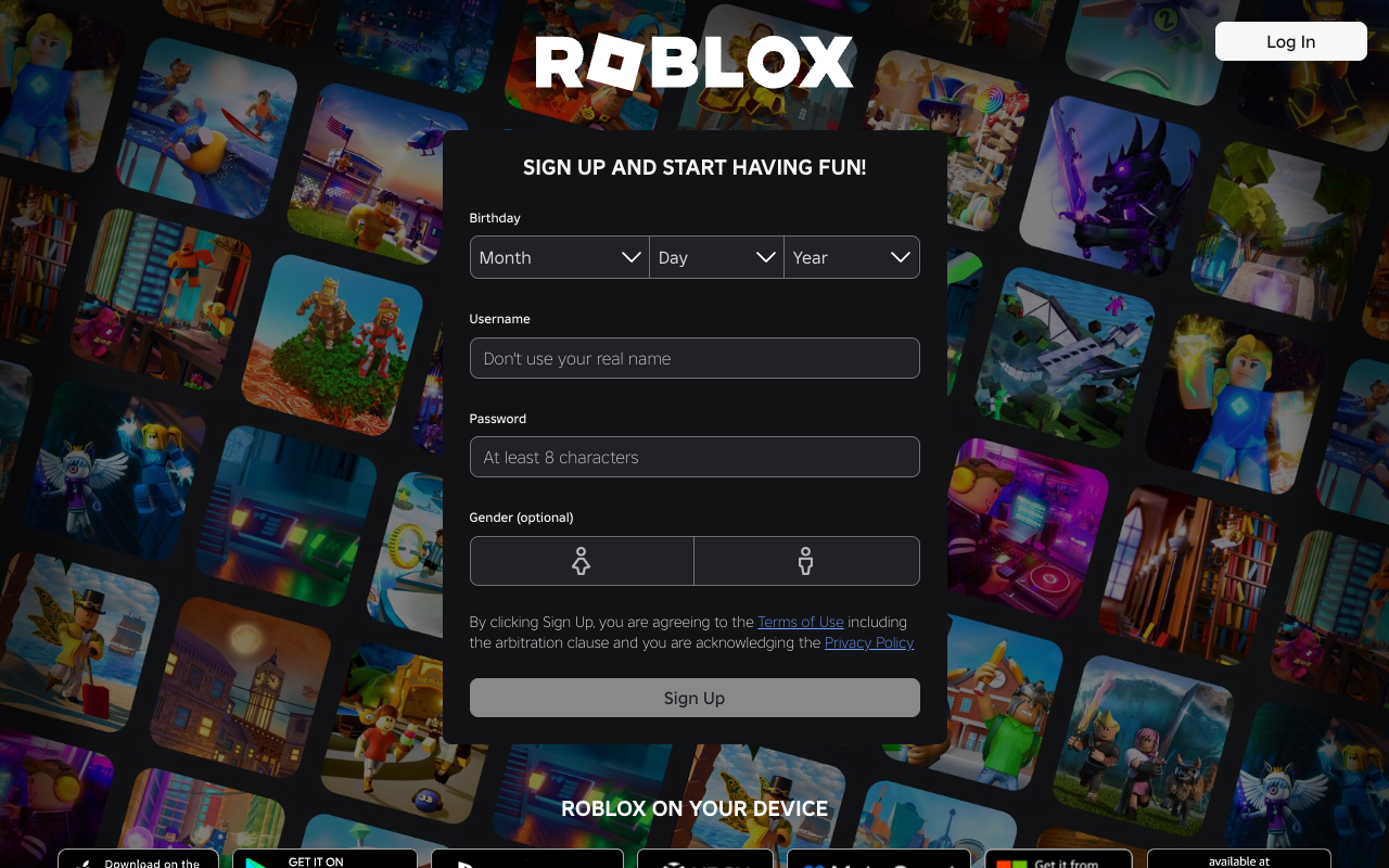
🔥 Roast Highlights:
- Legacy Bloat: The site loads hundreds of stylesheets, scripts, and tags—many likely unused. Performance? Meh.
- Corporate Vibes on Steroids: So many tracking tags, it feels more like a surveillance hub than a game platform.
- React Container Abyss: React setup with minimal visual cues for new users. You land on a login wall and... that's it.
- Nothing to Hook New Users: First-time visitors get zero delight—no preview of games, no testimonials, no buzz.
💡 Fix This:
- Streamline your assets—cut unused CSS/JS.
- Use hero sections or animations to hook new users with visuals or value props.
- Don’t assume users already love you. Prove it.
😏 Top Strengths
- The choice of black background certainly leaves no one doubting it's dark mode.
- There's a certain boldness in failing to use any modern design principles; it truly dares to be different.
- The buttons take up space, which is impressive in a layout sense, even if it’s in the wrong way.
- At least every banner has the same grim ambiance, creating a sense of relation amidst the chaos.
- It’s comforting to witness such dedication to a color palette that insists on being neutral—like a design that refuses to take a stand.
😬 Top Weaknesses
- The overused dark theme choices are practically begging to be dismissed as cliché.
- Icons that look like they’ve come straight out of a nostalgia-fueled design manual have very little relevance.
- The typography used is so bland it feels like it has all the personality of a damp sponge.
- Consistency is clearly a suggestion, not a requirement, as every section feels like it was designed by a different team.
- One can only chuckle at the amateur use of spacing, making you feel as though every element is vying for your attention inappropriately.
💥 4. CheapUI.com
Roast Persona: Grumpy UX Designer
Summary: “A classic case of missed connections—where text hides, buttons contemplate invisibility, and navigation embarks on a quest with no clear path.”
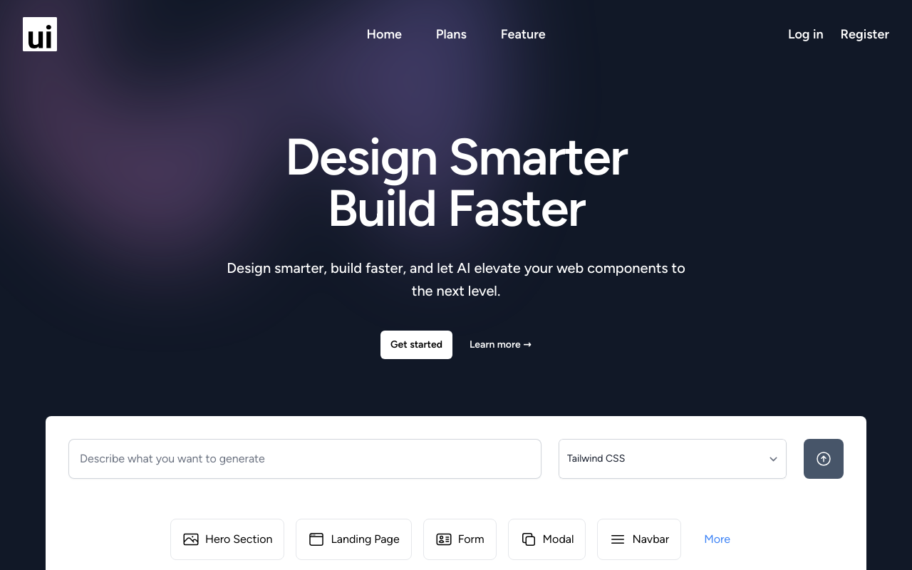
🔥 Roast Highlights:
- Text Camouflage Tactics: Fonts so faint they double as an eyesight exam. Why use contrast when you can use mystery?
- CTA Peekaboo: Call-to-action buttons are nearly invisible—like introverts at a networking event.
- Navigation by Vibes: It’s unclear where to go or how to get there. Users are left playing "Where’s the nav?"
- Zen or Zombie? The page is so calm, it might actually be asleep.
- Interaction: None Detected: Hover states and clickable feedback are missing in action—was this built in a museum?
- FAQ Section: Answers nothing. Literally.
💡 Fix This:
- Use clear color contrast for text and buttons.
- Highlight CTAs with bold designs and action-driven copy.
- Structure navigation with obvious labels and hierarchy.
- Add micro-interactions and hover cues to guide user behavior.
😏 Top Strengths
- The page has a Zen-like calm; users will find inner peace seeking out interactive elements.
- The dark, moody theme lends an air of sophistication—perfect for when incognito mode just isn't stealthy enough.
- Perfectly unassuming hover effects: more static than the average museum exhibit.
- With a color palette reminiscent of a distant winter, it keeps readers cool-headed.
- The loyalty to gray hues means no unnecessary bright distractions. Who needs readability?
- Unified footer design keeps secret the age-old question—am I a link, or a passive text?
- Text so faint that it doubles as a vision test—keeping users' eyesight sharp.
😬 Top Weaknesses
- Navigation couplets, like searching without a compass in a foggy land.
- Text colors blend into a uniform album cover—Vantablack vibes without the cost.
- Content hierarchy flows like an ancient labyrinth with dimly lit pathways.
- Got responsive design? Surprisingly, most don't have a clue.
- CTA buttons deeply committed to the 'blink and you miss it' strategy.
- FAQ section so interactive that nothing actually moves.
- The footer's link-list mimics a close-knit family: tightly packed, softly spoken.
💥 5. GetNowadays.com
Roast Persona: Grumpy UX Designer meets UI Comedian
Summary: “Your landing page is like a gourmet meal presentation with the elegance of a cafeteria tray. It's functional but, oh, so hard to swallow.”
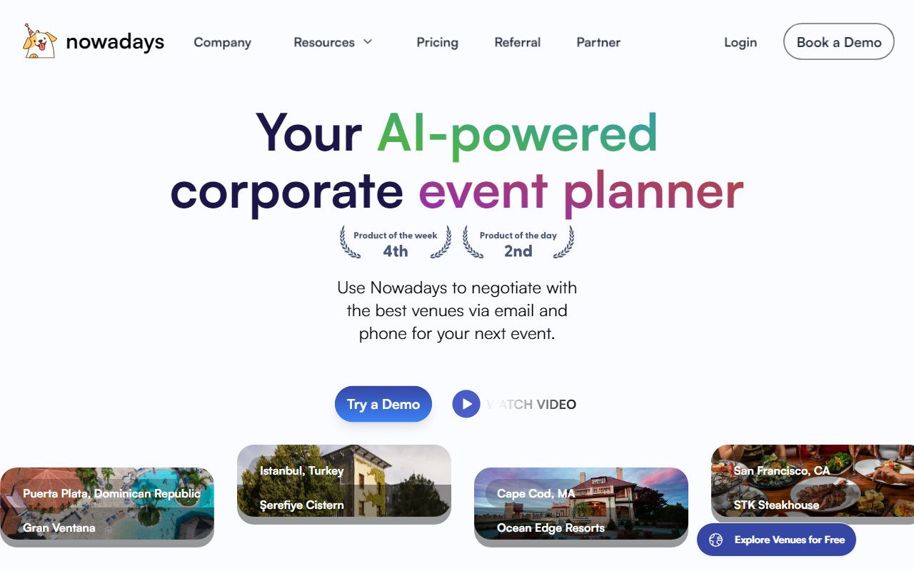
🔥 Roast Highlights:
- Gradient Gluttony: Buttons and backgrounds are drenched in gradients—some nostalgic, most distracting.
- CTA Hide & Seek: “Book a Demo” exists in an alternate reality.
- Hover Menus of Doom: Drop-downs are twitchy, hard to find, and barely usable.
- Headline Hierarchy Wreck: Fonts stack like Lego towers—unstable and confusing.
- Spacing Anxiety: Elements repel each other like introverts at a party.
💡 Fix This:
- Limit gradients to key visual highlights—don’t drench everything.
- Use consistent font sizing and spacing to build hierarchy.
- Ensure key CTAs are always visible and intuitive to click.
- Refine your navigation for hover stability and visibility.
😏 Top Strengths
- The minimalist design really saves on ink if someone decides to print the page.
- 'Your AI-powered corporate event planner' is an eye-catching motto—it's like getting first billing in a disaster movie.
- Dominant cool tones will totally feel 'icy' cool on users' moods, perfect for turning relaxation into cluelessness.
- Gradients on text somehow make it feel like 1996 all over again. Nostalgia points!
- Linear gradients know that blending in is totally the new standing out.
- Modals like the 'Watch Video' pop up as gracefully as surprise quizzes in a vacation.
- Beautiful gradient buttons with mysterious messages—users will love the challenge of a good captcha!
😬 Top Weaknesses
- Hover-to-reveal menus are like finding Waldo, except not fun and super frustrating.
- That headline's stack of styles competes with a skyscraper for height. Shall we call it the 'Tower of Text'?
- 'Explore Venues for Free' is strategically hidden like a rare Pokémon, good luck finding it!
- Color gradients make CTA text so cryptic, even seasoned cryptographers would shrug.
- Drop-down menus appear like they're in witness protection, all tense and jittery.
- 'Book a Demo' button lives in a parallel universe, safely away from the desperate user clicks.
- Spacing enforcement repels as if each element has caught digital cooties.
💥 6. Snowball.Club
Roast Persona: Grumpy UX Designer with Allergies to Clutter
Summary: “This landing page is like a nice sweater—looks good but itches at the seams!”
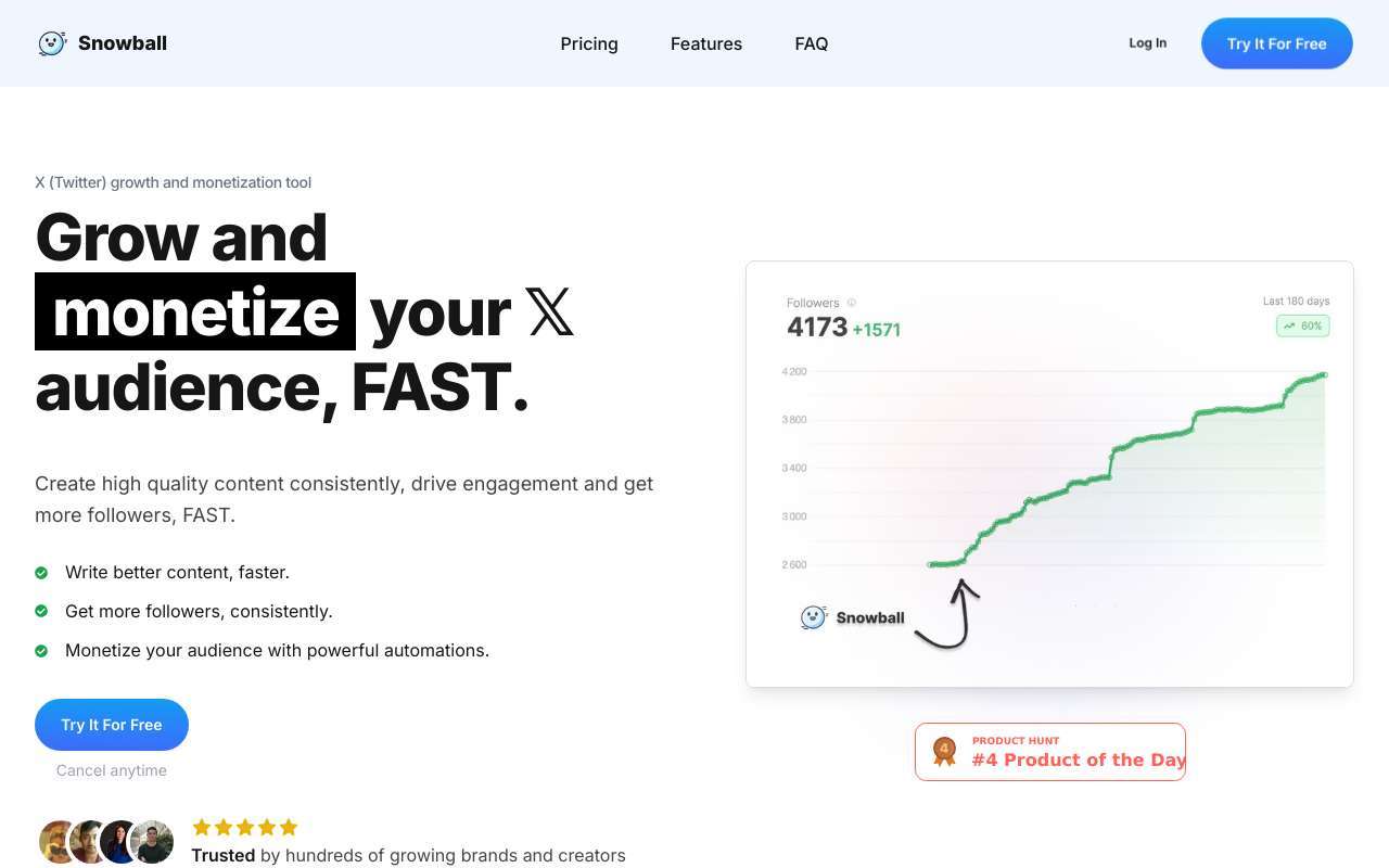
🔥 Roast Highlights:
- Button Overload: There are more CTAs than decisions in a choose-your-own-adventure novel.
- Gravy Navigation: Thick, sticky, and all over the place. Where are we again?
- TEDx Syndrome: Lofty headline claims with vague substance—“monetize your audience” tells us… nothing.
- Contrast Confusion: Colors blend into one another like a watercolor painting—pretty, but unreadable.
- Text Tsunami: Dense paragraphs scare users away faster than terms & conditions.
💡 Fix This:
- Limit CTAs to 1–2 per fold with clear purposes.
- Clarify your value proposition: what, who, and why.
- Use contrasting font/background combos for maximum readability.
- Break content into digestible pieces using spacing, bullets, and subheads.
😏 Top Strengths
- The dominant cool colors are as refreshing as an ice-cold lemonade on a summer day!
- The call-to-action buttons are bright and shiny—like a beacon for lost users!
- There’s a plethora of content that gives users the illusion of choice—who doesn’t love options?
- Using quirky phrases like 'monetize your audience' gives it that professional but playful vibe!
- The layout is responsive, ensuring users can enjoy this eye candy on both mobile and desktop!
😬 Top Weaknesses
- Too many buttons make this feel like a Game of Thrones episode—too many characters without a clear storyline.
- The color contrast is about as exciting as watching paint dry—where's the pop?
- Headline claims are lofty—if I wanted motivational speeches, I'd go to a TED Talk!
- We've got navigational confusion thicker than grandma's gravy; it’s all over the place!
- With a wall of text to read, your content is asking users to read a novel when they want a tweet!
- The call to action is more like a request; if I'm convinced, I might click...maybe!
- There's more clutter here than at a garage sale; time to declutter for clarity!
💥 7. KreateGPT.com
Roast Persona: Dark-mode cynic who misses light mode dearly
Summary: “A bewildering blend of dark themes and missed opportunities, this page is like a black hole for user engagement.”
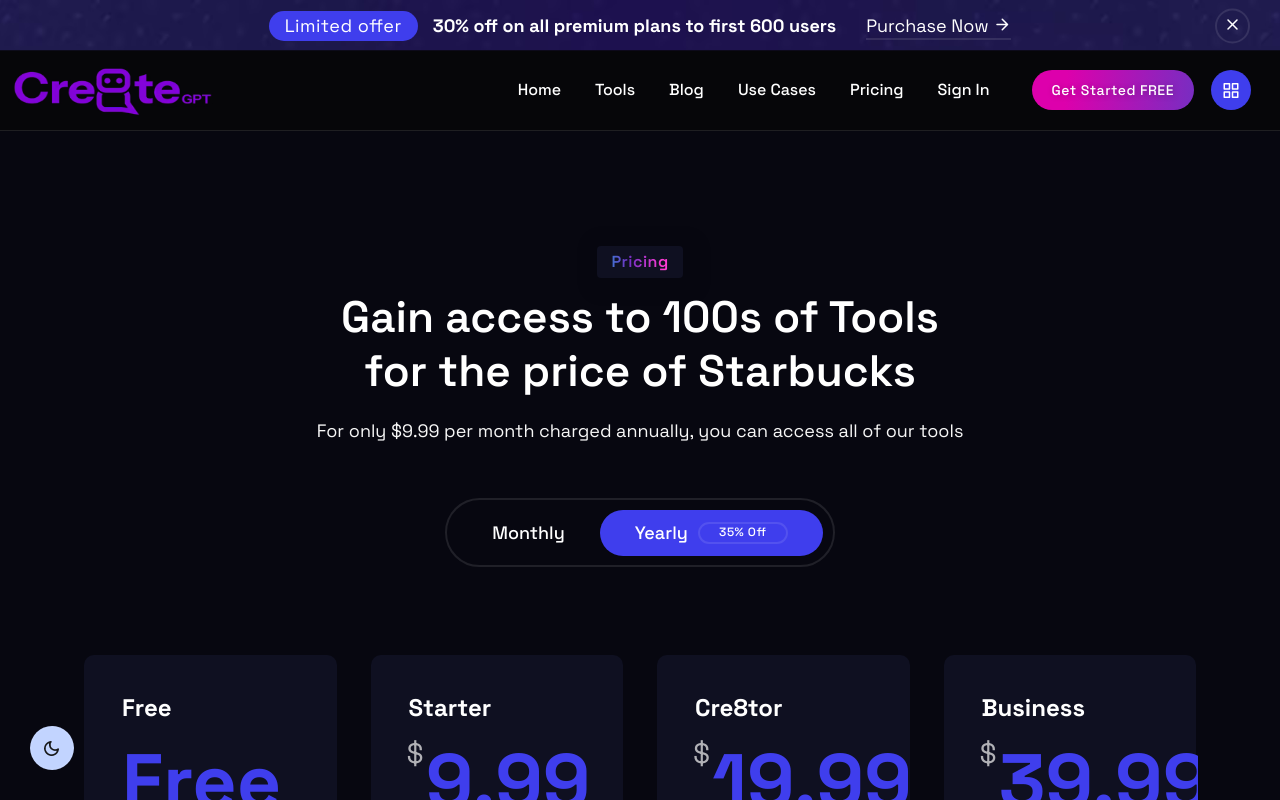
🔥 Roast Highlights:
- Dark Mode Overkill: Stylish? Sure. Usable? Not when you're squinting at 11 a.m.
- Invisible CTAs: Buttons that blend into the background = low conversions.
- Maze Navigation: Links are hard to find, and the pricing tiers? Confusing at best, purgatory at worst.
- Unreadable Typography: Fonts over dark backgrounds with minimal contrast… need we say more?
- Pricing Table From Hell: No unique selling points, just… tiers. Bland, sad tiers.
💡 Fix This:
- Add contrast to your dark mode (white/bright colors for text & CTAs).
- Use distinctive CTA designs—make them pop.
- Simplify pricing structure and label tiers clearly.
- Improve spacing and interaction around pricing elements.
😏 Top Strengths
- The idea of AI tools is as shiny as a freshly polished UFO; it really catches the eye!
- The range of services looks promising, like a buffet where half the items are inedible.
- It's hard to overlook that you've at least made efforts to categorize your tools—too bad there’s no map to find them!
- The offer excitement is almost palpable—if only we could see it!
- Those icons are like street performers; they entertain but might leave you wondering what they're actually selling.
😬 Top Weaknesses
- The text readability is so poor I might as well hire a translator to decipher it!
- The navigation structure? It's like a maze designed by a puzzle master—good luck finding your way out!
- Your buttons are so underwhelming they could double as wall decorations—nice but utterly useless!
- Using dark themes for such an interface? My 90-year-old grandmother could tell you that's a security blanket and you really don't need it.
- The responsiveness feels less mobile-friendly and more like 'No entry after 6 PM.' What a party pooper!
- Every pricing option really does feel like a different tier of purgatory without appealing names or unique advantages.
- The interaction with the pricing table is about as smooth as a sandpaper hug. Who's excited about misclicking through this?
💥 8. AimFox.com
Roast Persona: UX firefighter dousing design wildfires
Summary: “A rollercoaster of design chaos and accidental misclicks.”
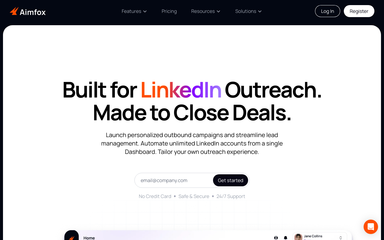
🔥 Roast Highlights:
- Clutter Carnival: Visuals and text overlap in a chaotic collage of distraction.
- Heading Jenga: Typography stacks inconsistently—ready to topple at any moment.
- CTA Confusion: Multiple buttons clustered in one spot like a trap.
- Unreadable Layouts: Dense content and poor spacing = headache city.
- Navigation by Braille: Users must feel their way around blindly.
💡 Fix This:
- Separate visual and textual elements for clarity.
- Build a clear content hierarchy with proper heading levels.
- Reduce button overload—one goal per section.
- Increase spacing and simplify navigation paths.
😏 Top Strengths
- The color palette screams 'look at me!' but in a way that makes me want to look away.
- The button sizes are big enough that even the clumsiest of users could click them.
- There's a unique approach to layering content—too bad users feel like they’re under an avalanche.
- The visuals are plentiful—the perfect distraction if you ignore the surrounding chaos!
- Mobile responsiveness exists, though it’s more like a casual suggestion than a necessity.
- The promise of '24/7 Support' makes me wonder who would be awake to answer these questions.
- The 'No Credit Card' claim is like a siren call for all budget-conscious adventurers.
😬 Top Weaknesses
- The heading structure resembles a game of Jenga—will it collapse under pressure?
- Users may complete an expedition through your content and still have no clue what they need.
- Too many CTAs in one area makes it feel like decision-making is a game show with a grand prize of confusion.
- Your readability is challenged like an Olympic sport—who wants to struggle to read?
- Visual design is so cluttered that even the words plead for independence!
- The navigation is less a guide and more a treasure map—good luck finding the X!
- The lack of content spacing means I might accidentally trigger a ‘content takeoff’ into orbit!
💥 Common Mistakes Across All 10 Sites
Let’s talk about what everyone seems to be getting wrong:
🔻 1. Navigation Menus That Fight Back
“We get it—you love options. But nobody wants to play ‘Where’s Waldo?’ on a nav bar.”
- Menus were often overloaded, hidden, or visually cluttered.
- Tip: Use dropdowns, mega-menus, or anchor navs. Simplicity wins clicks. Roast your page to see how your nav scores.
🕳 2. Invisible or Dysfunctional CTAs
“What’s worse than a hidden button? A button that does nothing.”
-
Many sites had:
- Low-contrast buttons
- Generic text like “Learn More” (about what?!)
- Broken or non-functional actions
-
Tip: Use high-contrast buttons with value-driven copy and test their functionality—obsessively. Get the Conversion Consultant to roast your CTAs.
🎭 3. No Visual Hierarchy
“Every section was yelling like kids at recess.”
- Pages had multiple competing modules (testimonials, CTAs, carousels, headers) with no clear path.
- Tip: Choose one main goal per section, guide users with font weights/sizes/colors.
👓 4. Readability Crimes
“Low contrast text should be classified as a felony.”
- Light grey text on white backgrounds. White text on busy images. Font sizes under 14px. You name it, we saw it.
- Tip: Dark-on-light or light-on-dark with strong contrast ratios. Bonus points for accessibility tools.
🧊 5. Dead Interactions
“If it looks clickable but does nothing… why is it there?”
- Carousels with no arrows. Icons with no hover states. Buttons that don’t react.
- Tip: Add feedback states (hover, click, expand). Even small animations = major trust.
🤖 The RoastGPT Takeaway
These sites ranged from over-designed fever dreams to corporate placeholders. But the lesson is clear:
✅ Form needs function.
✅ Pretty without purpose is pointless.
✅ You can’t convert users you confuse.
🔥 Want to Know If Your Landing Page Sucks?
Get the same treatment: scores, section-level feedback, and screenshots. Roast your landing page for free—pick a persona, paste your URL, and see what the AI finds. It’s free, fast, and fun.
Roast your landing page now →
See more roast examples or read Part 1 for the mistake roundup.
And if you laughed, learned, or winced in pain—
Buy me a coffee ☕️. Because the roast never sleeps.